I led the redesign and replatforming of the Groceries Homepage, combining a long-term vision with early experiments to validate key ideas and ultimately driving a 66% uplift in CTR.
This case study covers the challenge, the Discovery and Define phases, the cross-functional approach, final mobile UI, some of the A/B experiments we conducted, and the impact in metrics and influence.
End to End Lead Designer
Sainsbury's
Vision · Cross-functional workshops · Data personalisation
March to November 2022
The homepage offered little value beyond search and login, with low content engagement and outdated tooling. To support the new CMS platform and deliver a more modern, personalised and engaging experience, we needed to redesign the page so it felt truly relevant to customers.
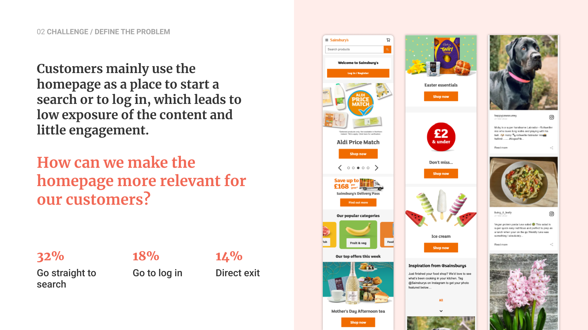
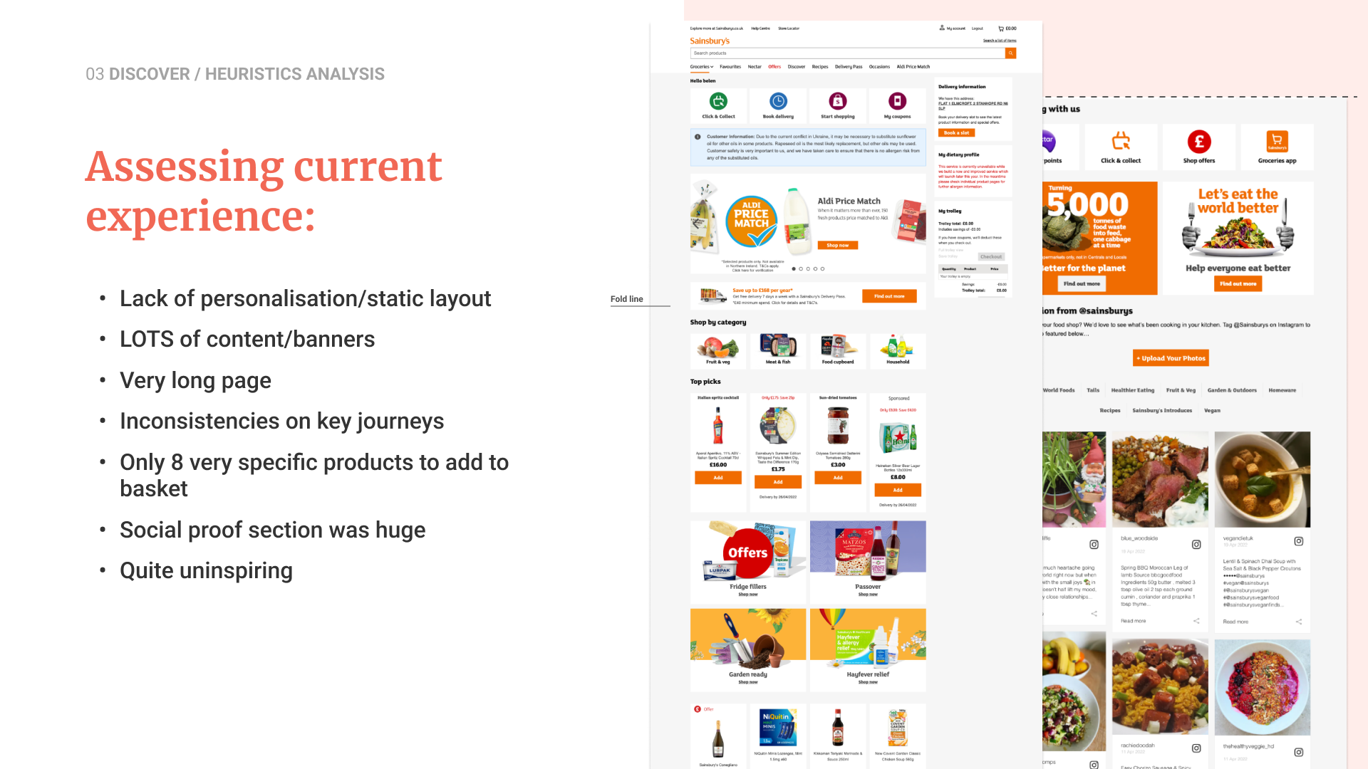
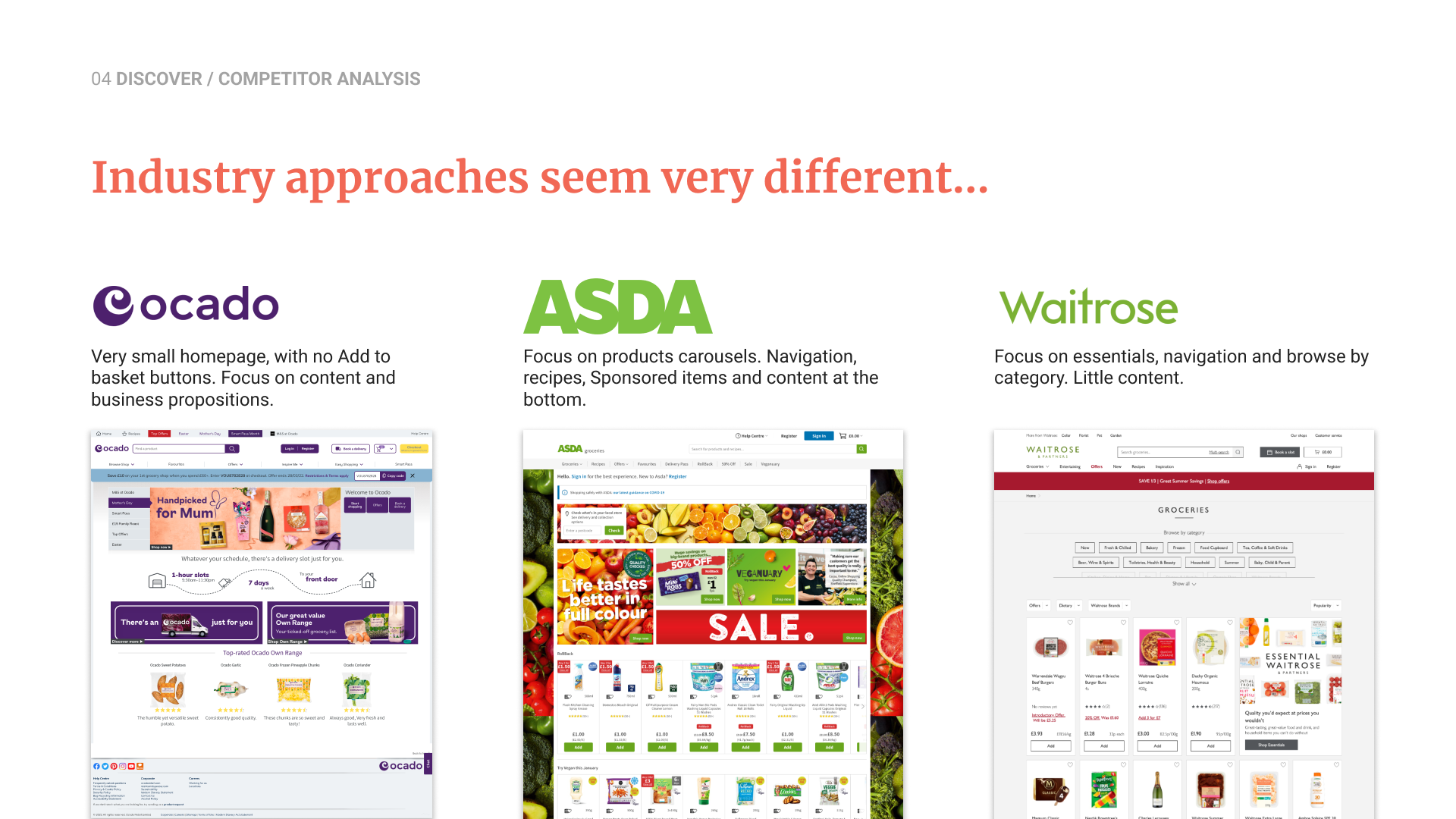
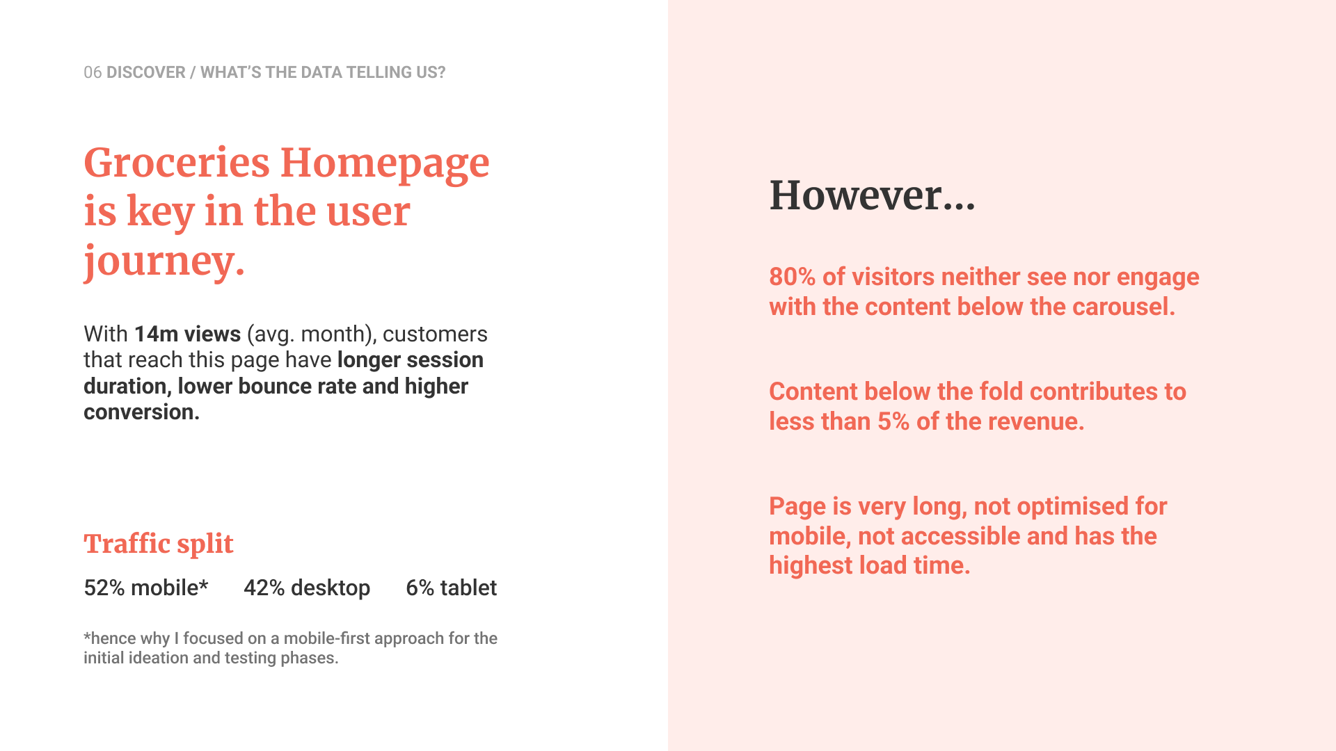
Heuristics, competitor analysis and data showed the homepage was long, static, unspiring and underperforming (80% of users never engaged with content below the carousel).
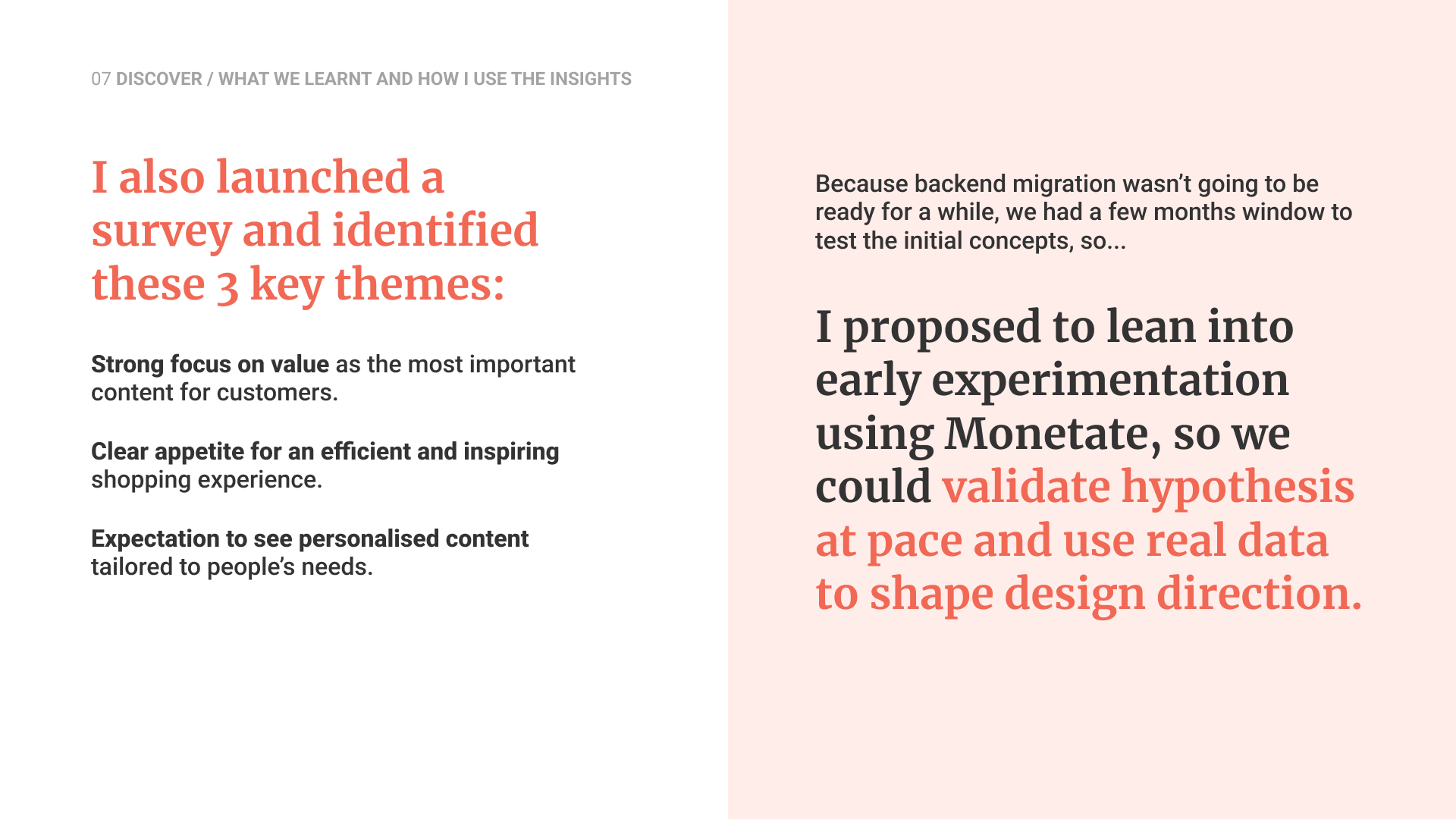
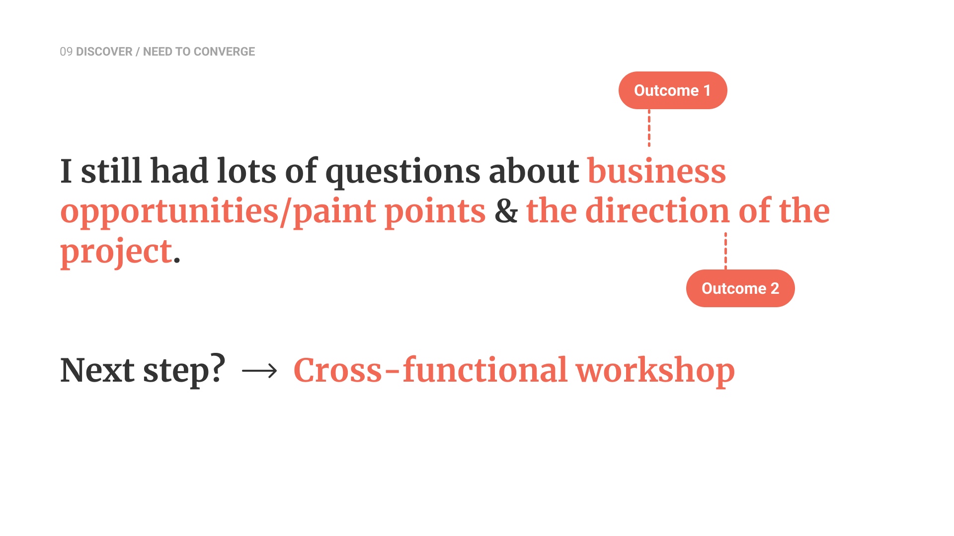
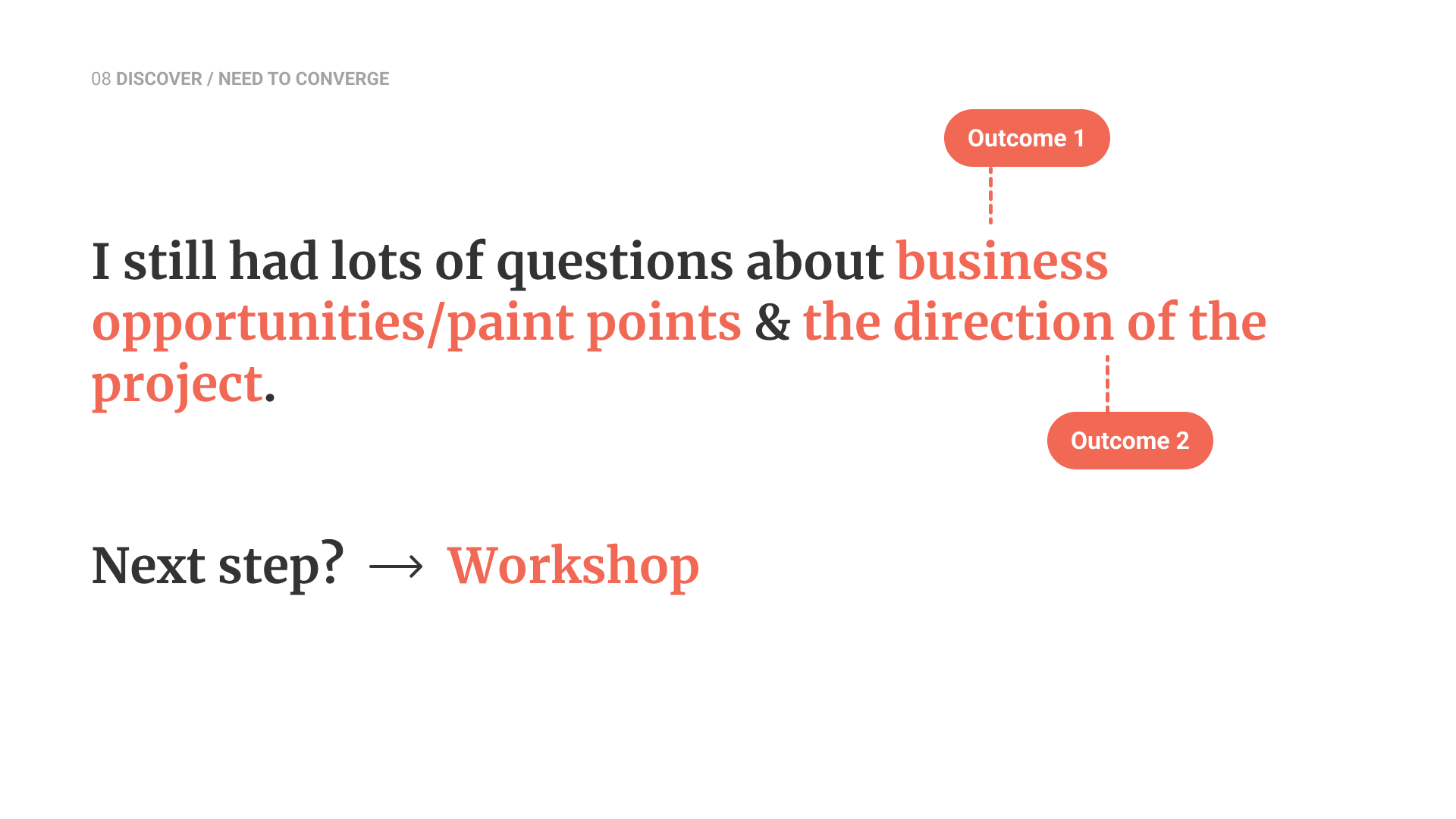
Stakeholder mapping and a survey highlighted the need for value, efficiency and personalisation. With migration still months away, I initiated early experiments using the testing platform Monetate to validate hypotheses and guide the design direction.

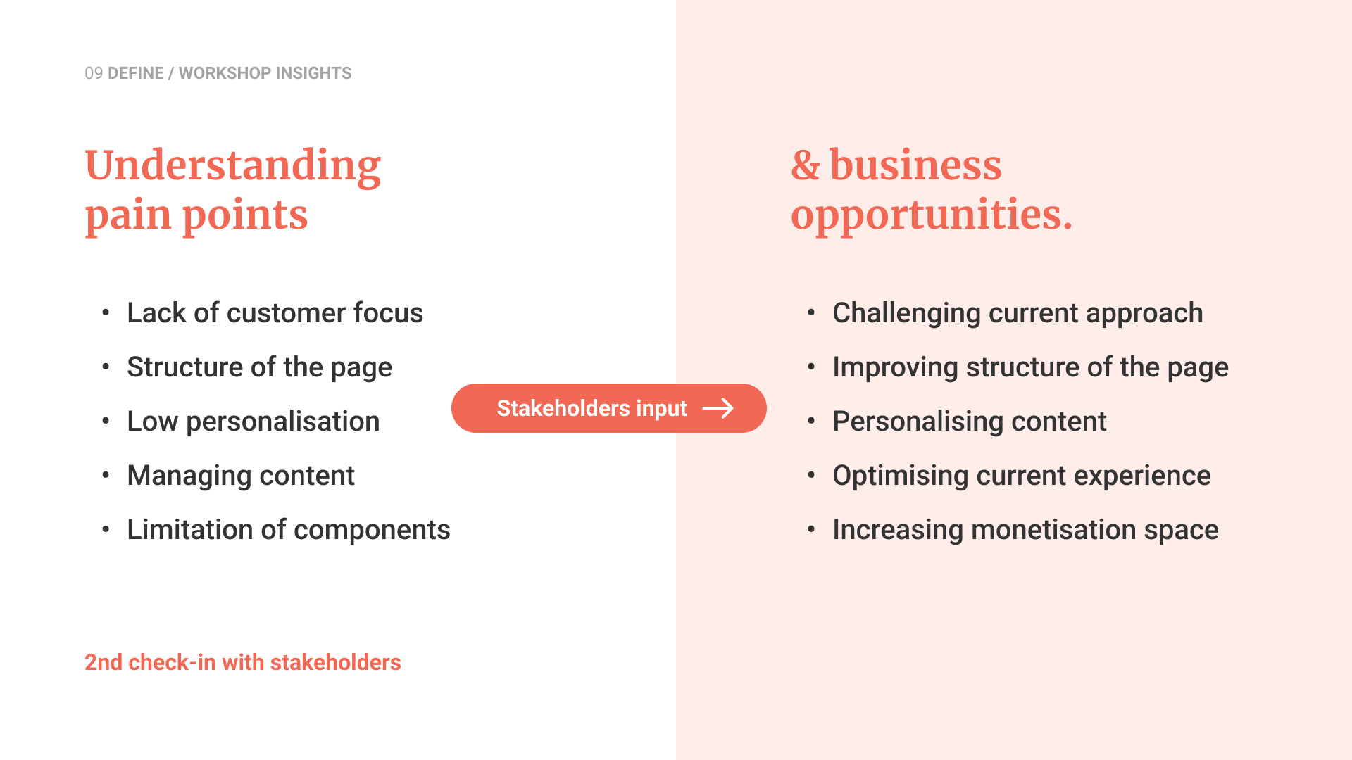
From a cross-functional workshop, we aligned on the core pain points → low customer focus, poor content structure, limited personalisation and restrictive components; and reframed them as opportunities to improve relevance, efficiency and monetisation.
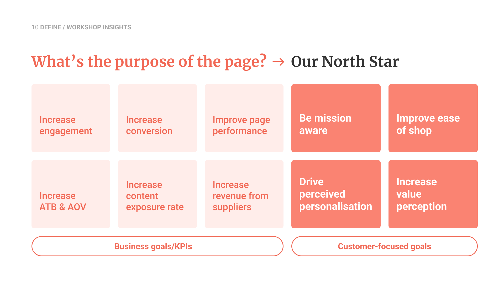
This led us to a shared North Star: increase engagement and conversion while making the page easier to shop, more personalised and more mission-aware.
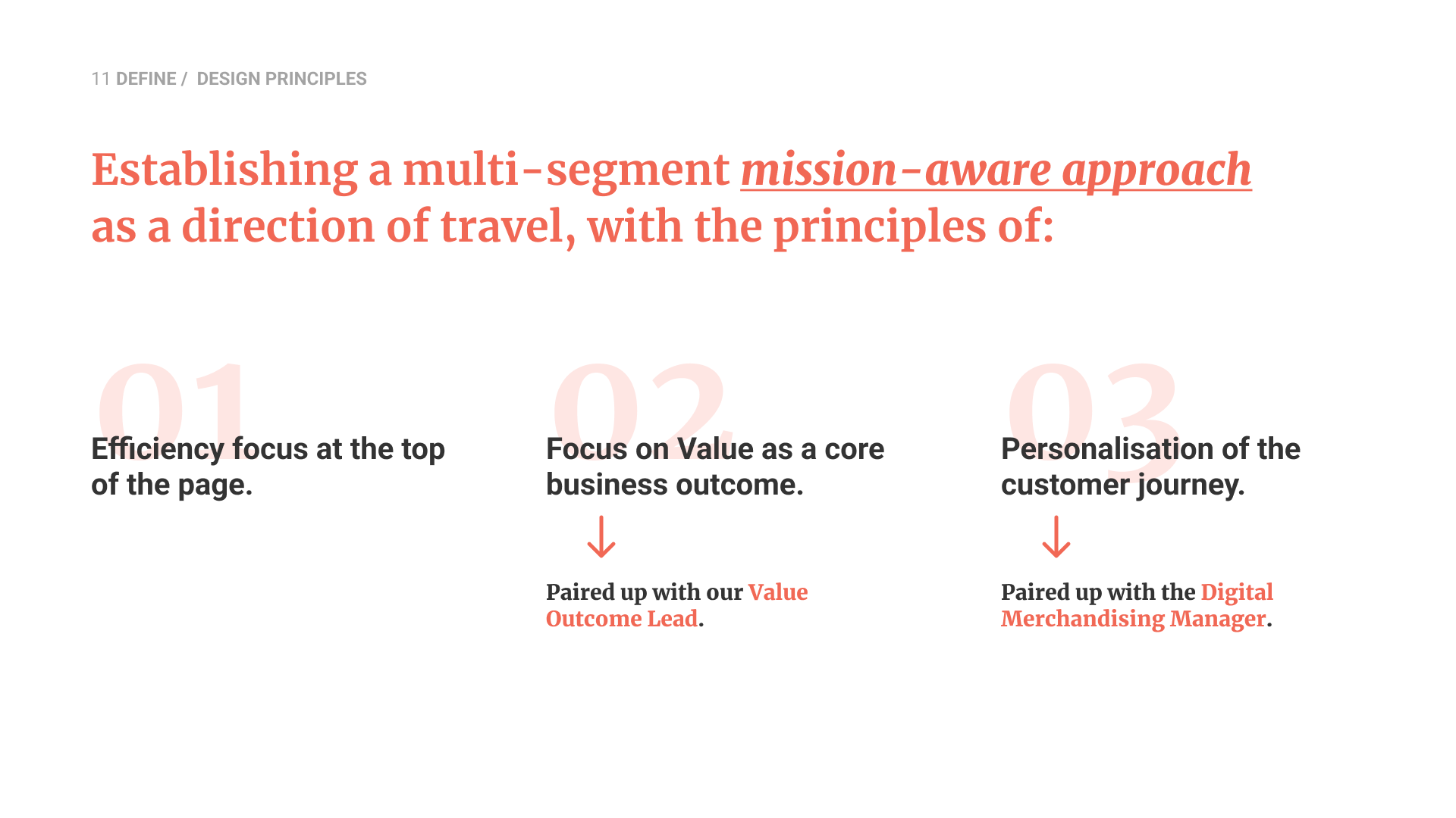
To guide the design direction, we established three principles: efficiency first at the top of the page, a strong emphasis on value, and personalisation across the journey, partnering closely with value and merchandising leads to ensure alignment.
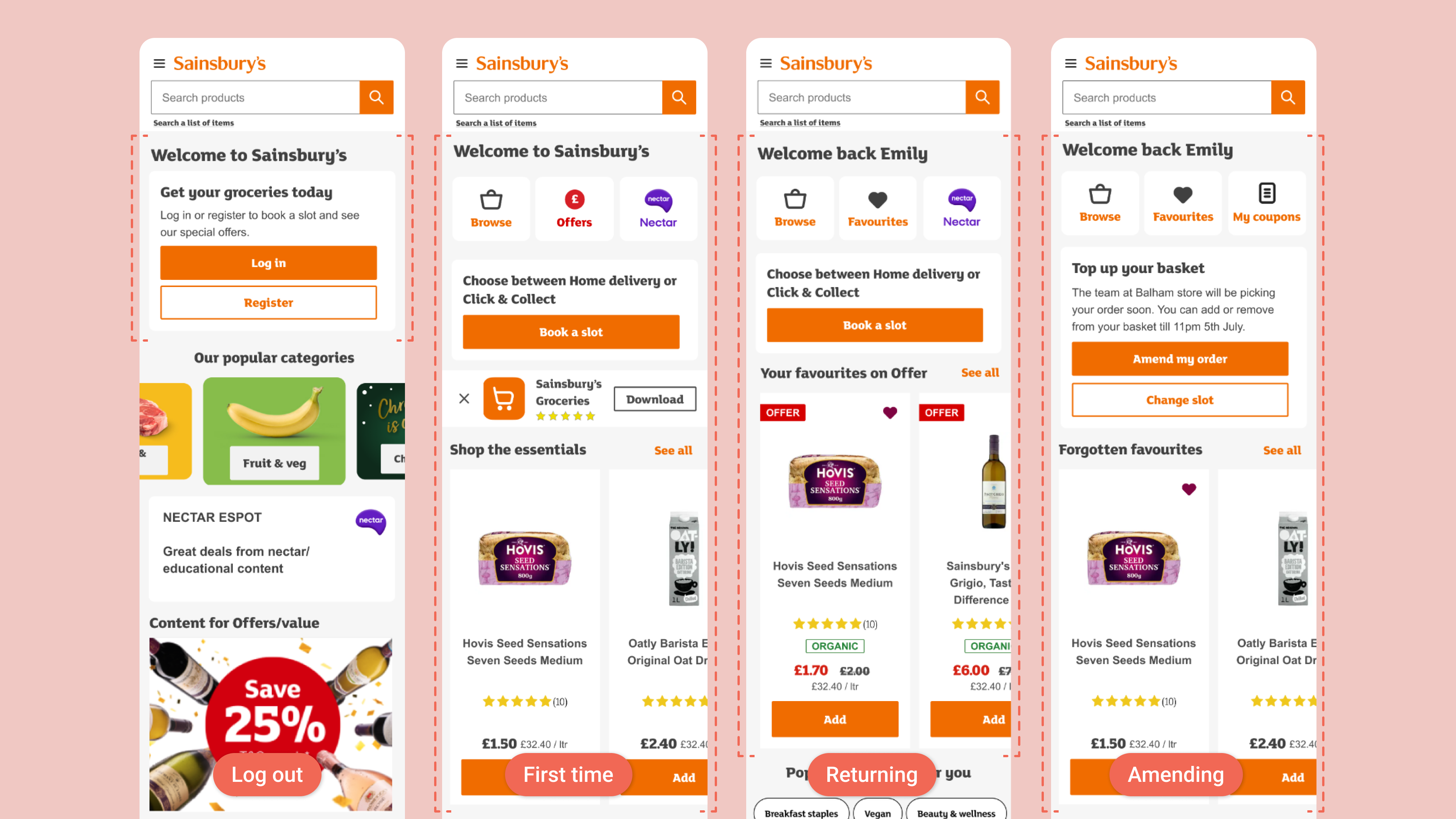
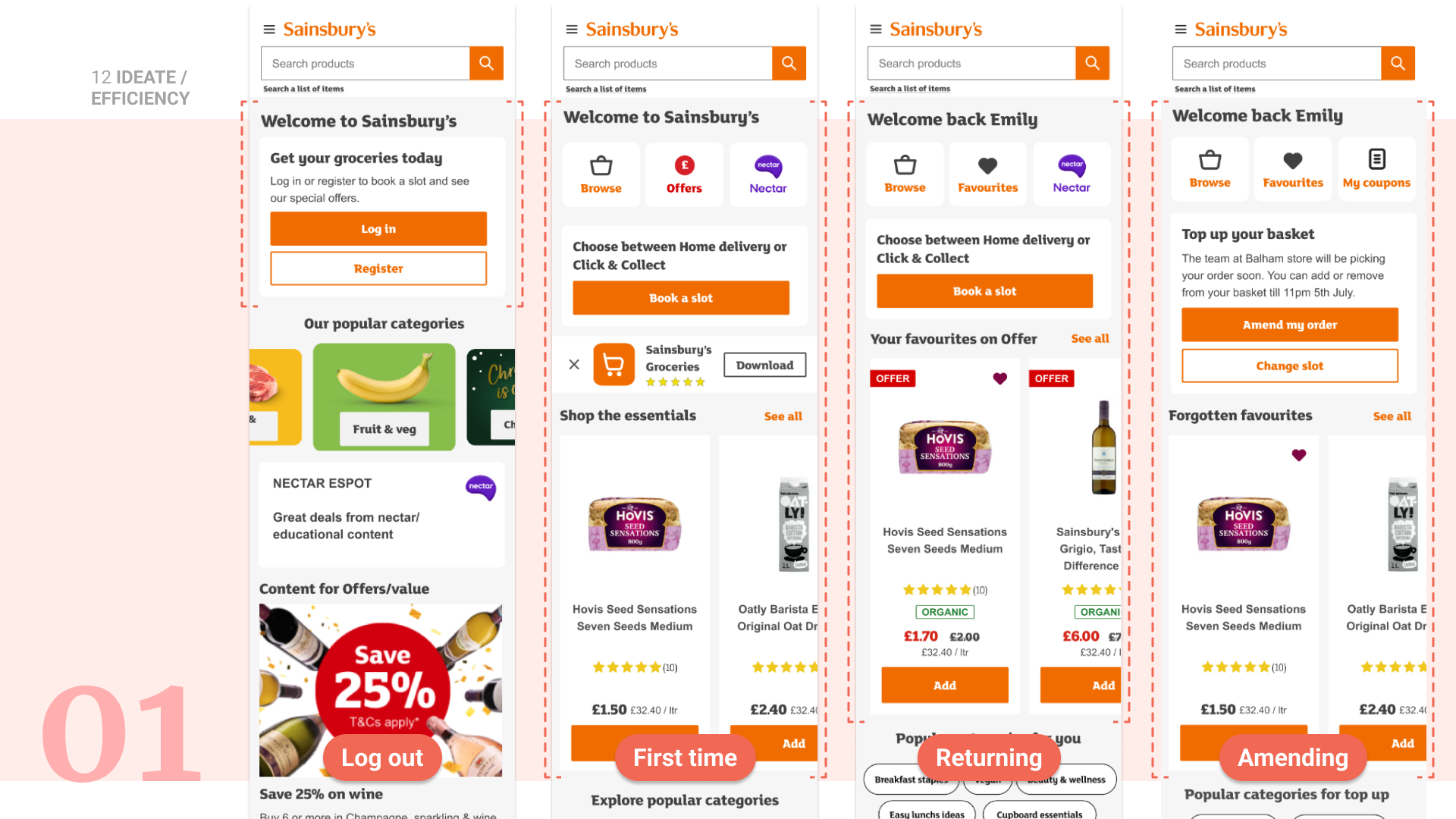
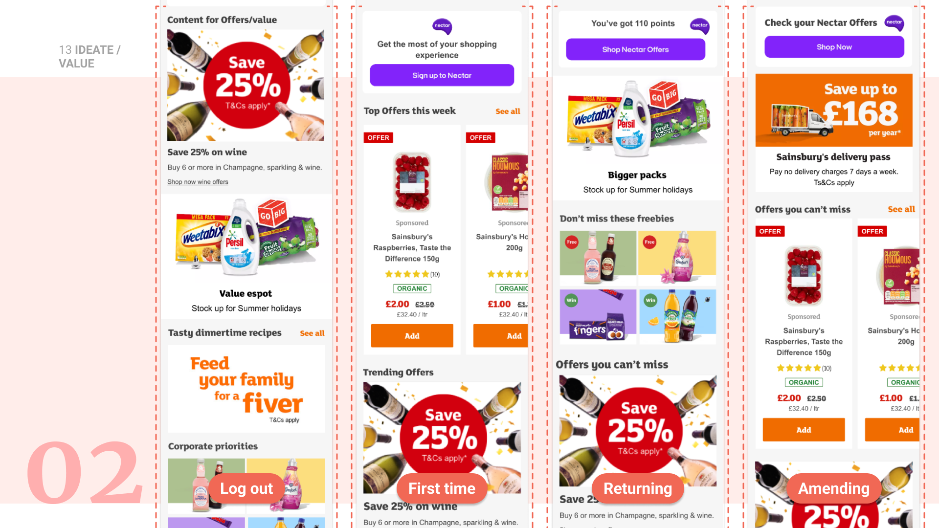
Guided by our principle of being mission aware, I explored the concept of creating variants of the homepage based on the following customer segments → Log out, First-time customers, Returning shoppers and Amending journey.
I focused on ease at the top-of-page, bucketing up value-led content in the middle, and personalisation of the customer experience such as favourites, forgotten favourites, coupons, Nectar points, Top-up basket component, previously viewed products, etc. These early concepts helped us visualise how a mission-aware experience could better support different shopping behaviours.
A design critique workshop with the wider group allowed us to fill content gaps, validate the direction and feed improvements back into the next iteration.

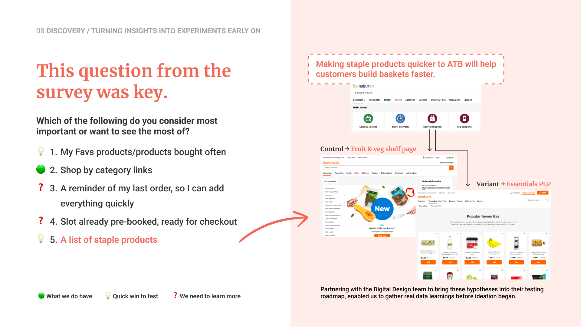
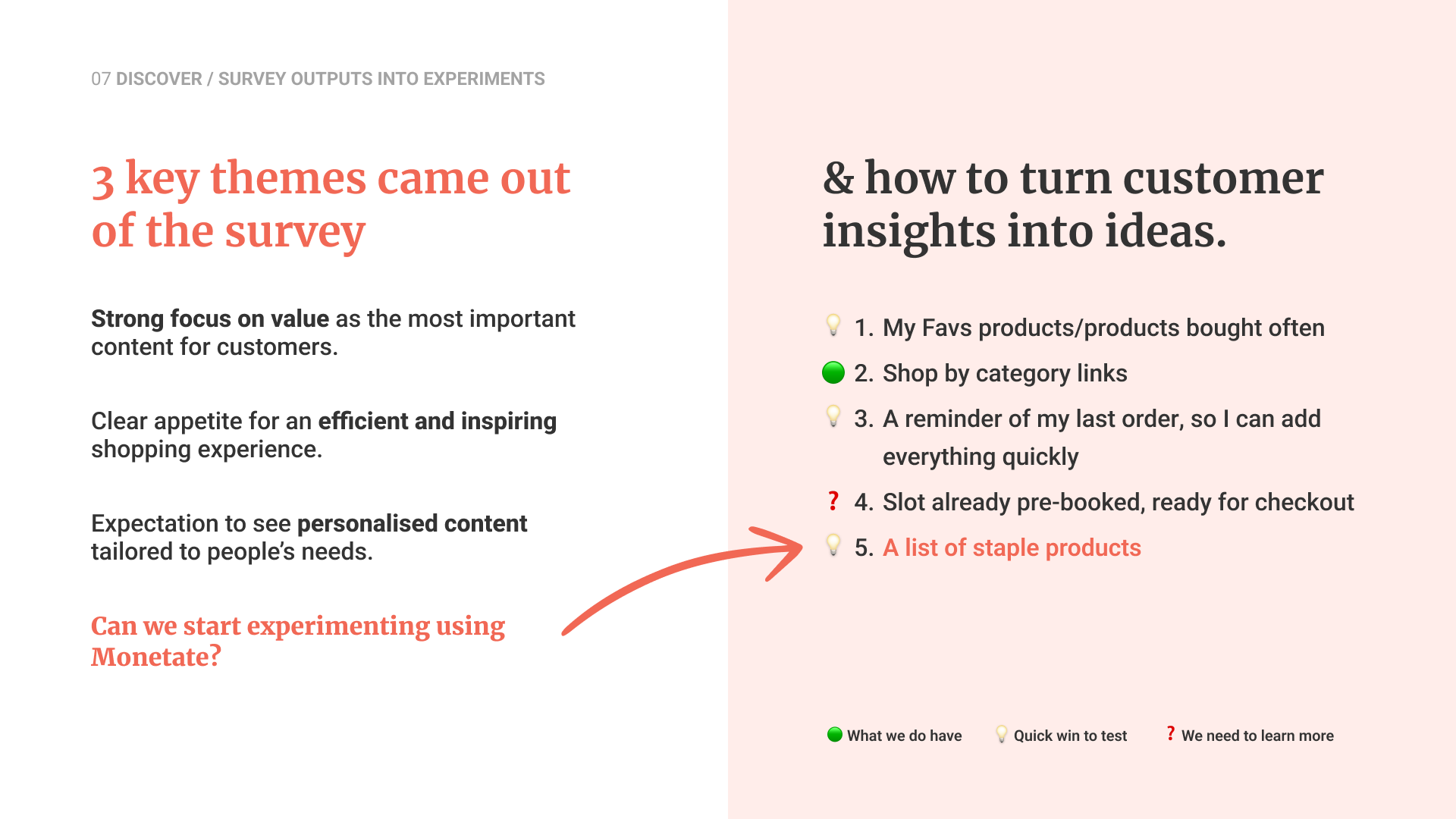
To help me with the Validation phase, I created an Hypothesis matrix where I documented all the hypothesis we wanted to validate, either through Monetate or User Testing. Because we still had a long way to the migration, we prioritised using Monetate to launch a series of A/B and multivariate tests.
Experiments such as “Previous Orders quick add,” “Quick Links optimisation,” and “Basket building vs content” all outperformed the control, confirming strong customer appetite for clearer actions and relevant product content on the homepage.
This work delivered significant uplifts, including a 66% CTR increase for targeted vegan/vegetarian content, 8.1% CTR uplift for grouped value messaging, and improvements in ATB, AOV and bounce rate. With several efficiency variants still live three years later.
Beyond metrics, the early experiments and the cross-functional sessions influenced the e-commerce and trading teams to reprioritise content ahead of migration, remove the hero carousel, restructure value content and improve labelling, ensuring the experience became more customer-focused even before the new platform launch.

let's connect.