I designed and launched the Seasonal Favourites carousel, used in 35% of customer sessions in its first quarter and increasing seasonal participation from 5% to 25%.
This case study outlines the challenge, my data-informed approach to refining hierarchy and copy, examples of the reusable carousel pattern I introduced to the Luna Design System, and the impact delivered.
End to End Designer
Sainsbury's
User testing · Commercial impact · Design Systems
January to April 2021
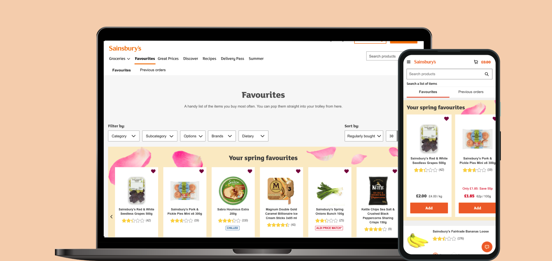
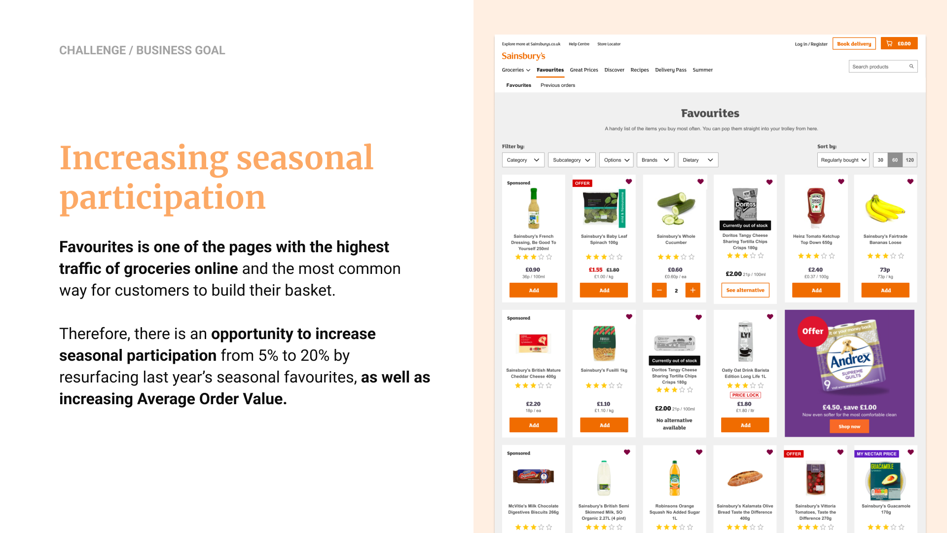
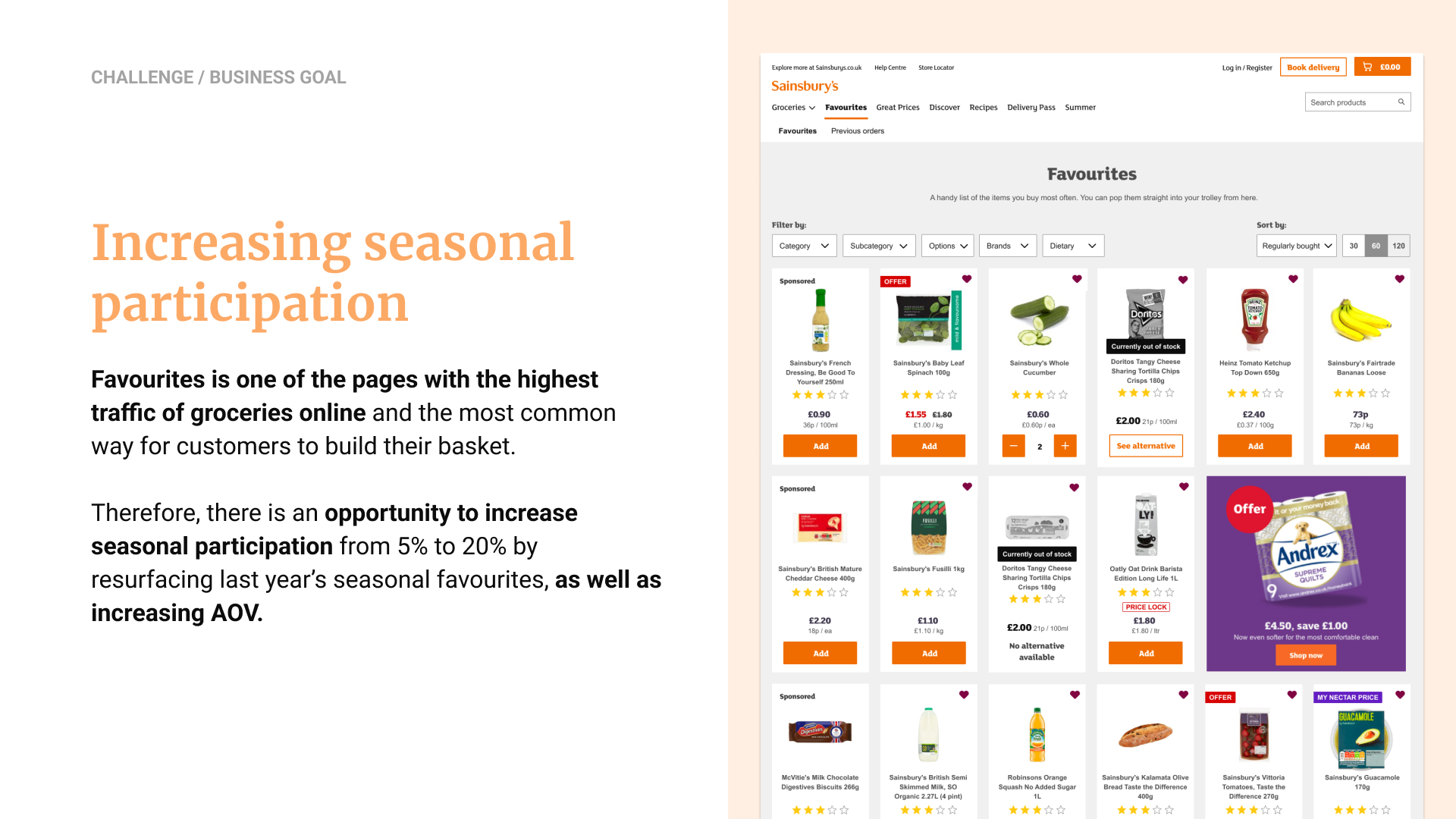
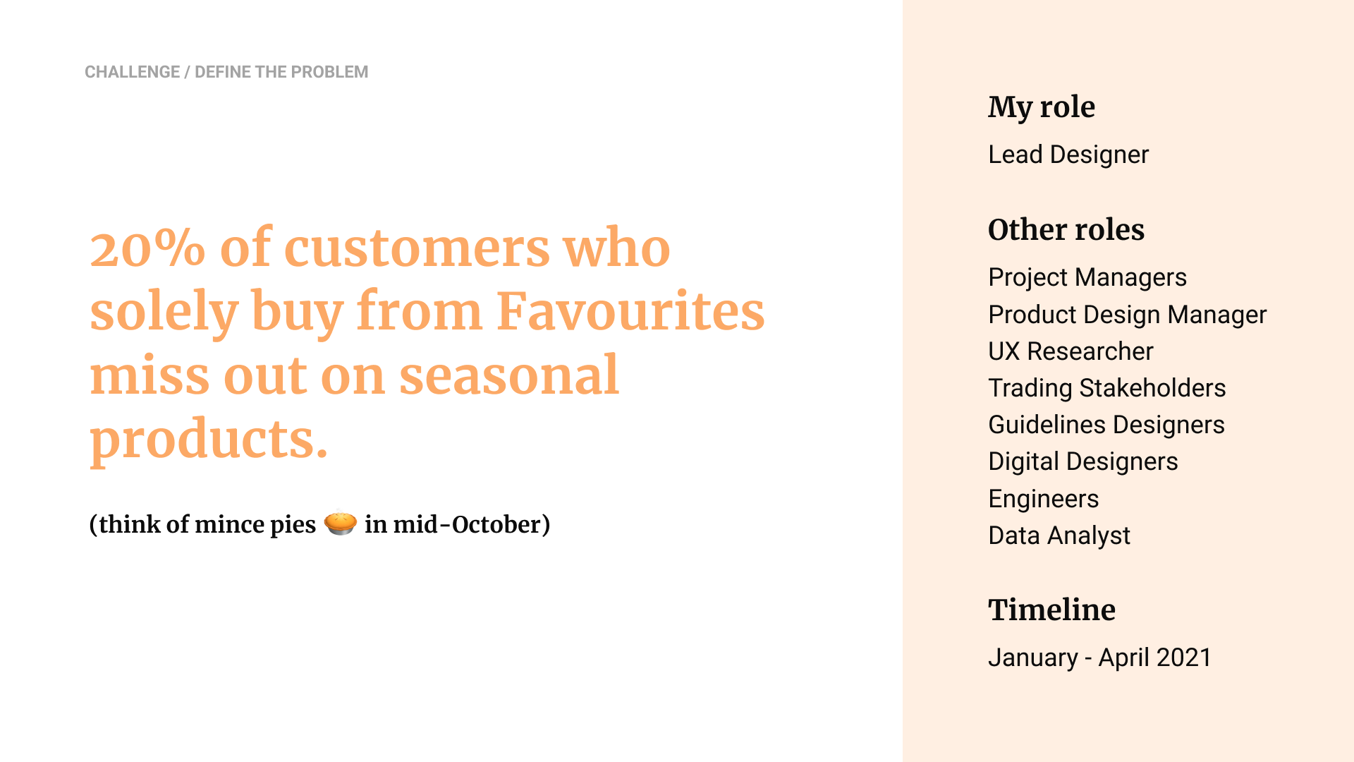
The business goal that we were working with was increasing seasonal participation. Favourites had a 40% traffic and it was the most common way for customers to build their basket. There was an opportunity to resurface last year’s seasonal products for customers who tend to shop solely from this area and were therefore missing out on key moments like Christmas ranges.
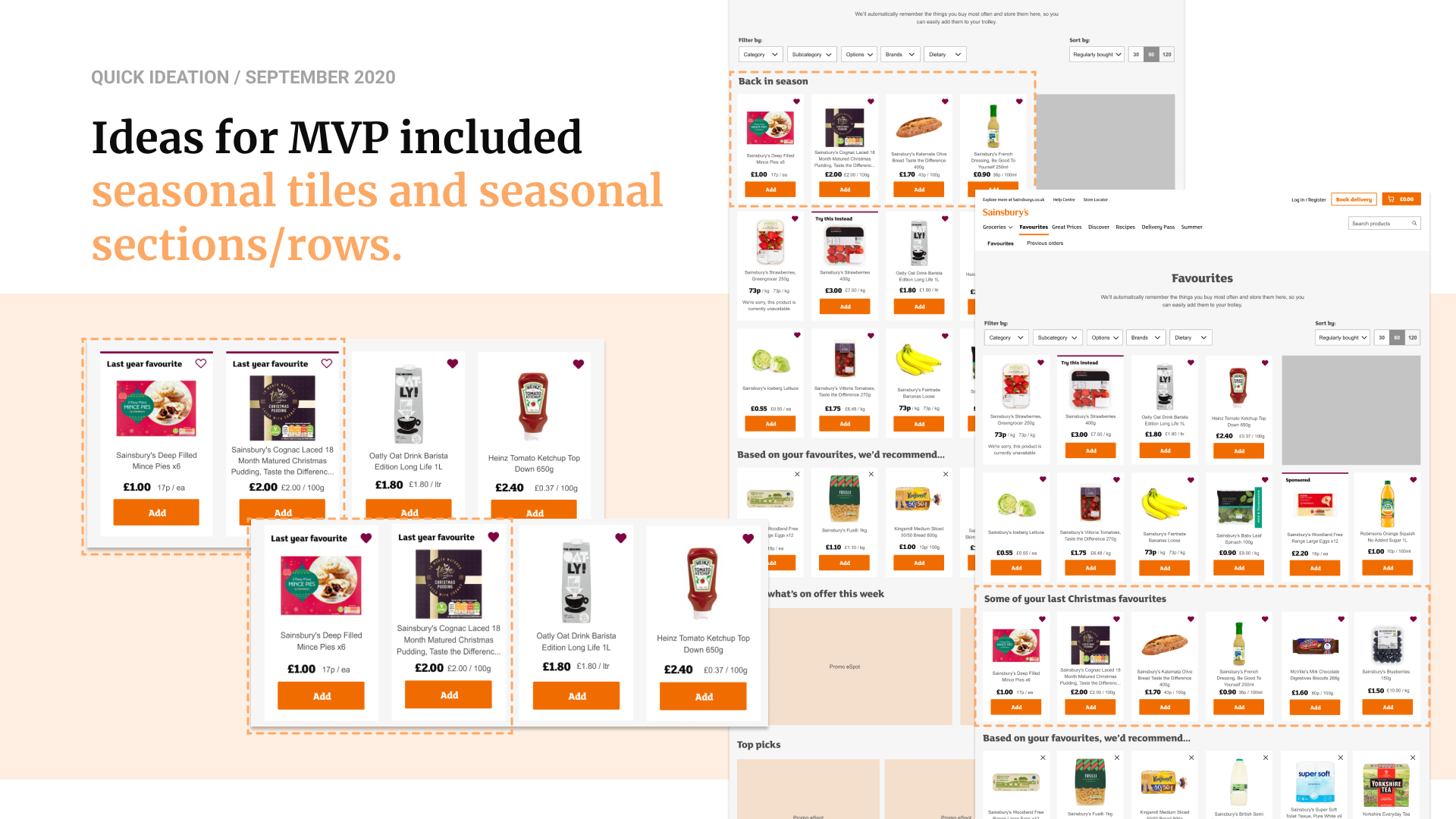
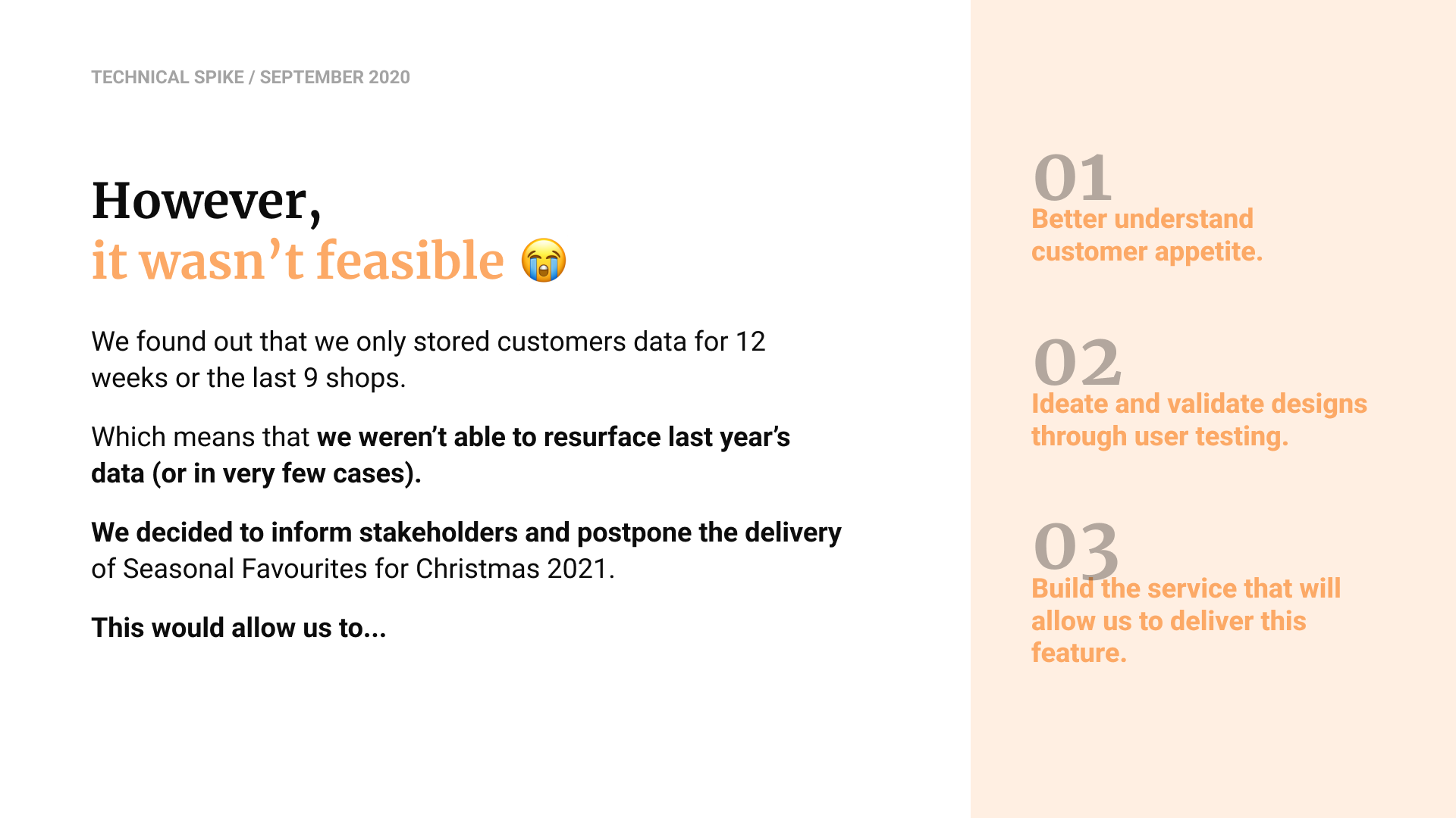
Early MVP concepts included seasonal tiles and dedicated seasonal rows, different copy ideas as well. But a technical spike revealed that the business only stored 12 weeks of customer data, making it impossible to reliably retrieve last year’s items. After aligning with stakeholders, we postponed delivery and pivoted toward a longer-term approach: understanding customer appetite through research, validating design directions via user testing, and partnering with engineering to scope the new API needed to enable the feature for the next seasonal peak.
To understand how seasonality surfaced across the groceries experience, I audited the end-to-end journey and reviewed available data, which showed that customers clearly notice seasonal events and often add items after seeing them.
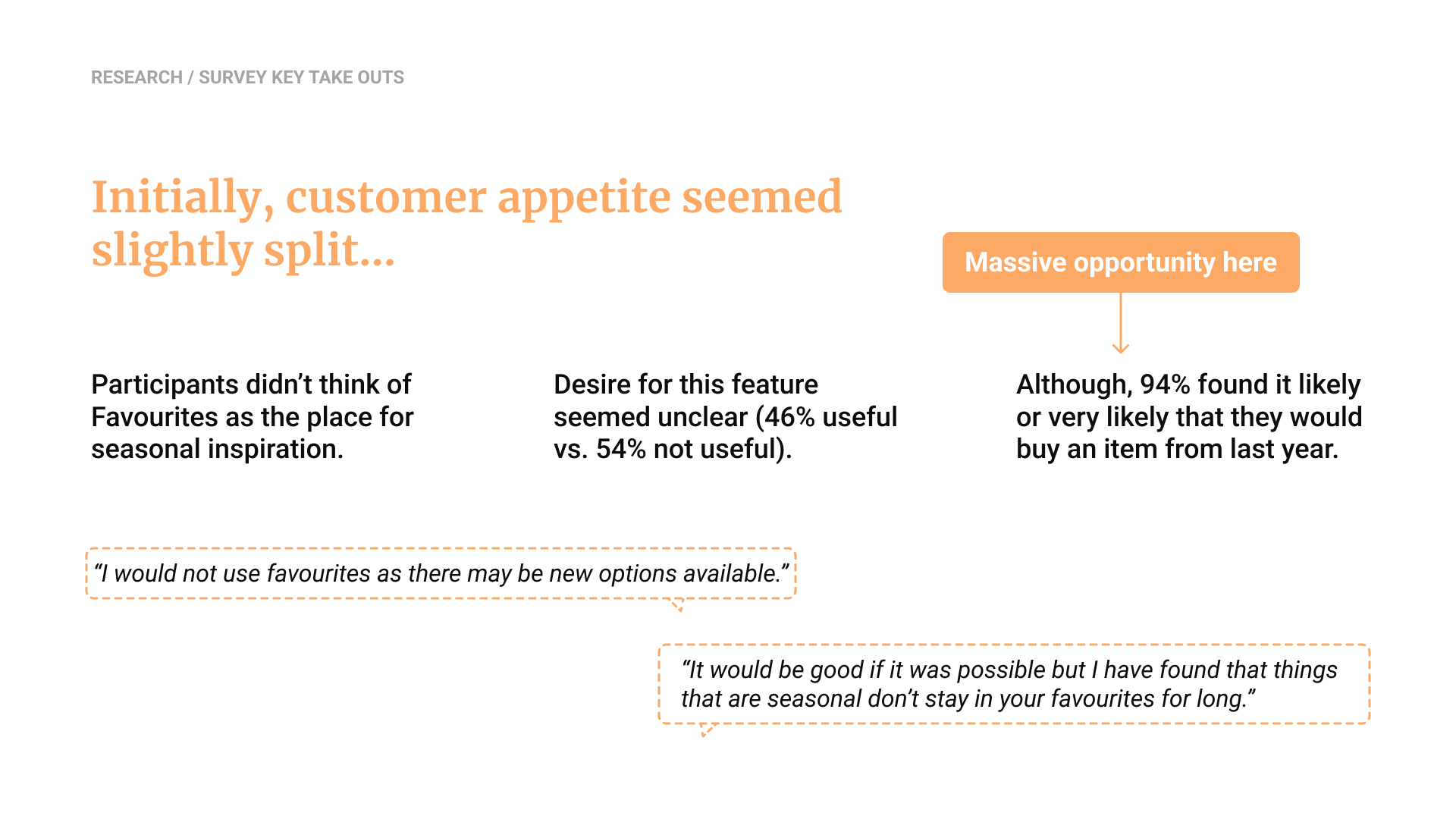
However, early survey insights revealed mixed appetite for the feature, customers didn’t naturally see Favourites as a place for seasonal inspiration, and only half initially considered the feature useful. Yet a strong signal emerged: 94% said they would likely repurchase seasonal items from last year.
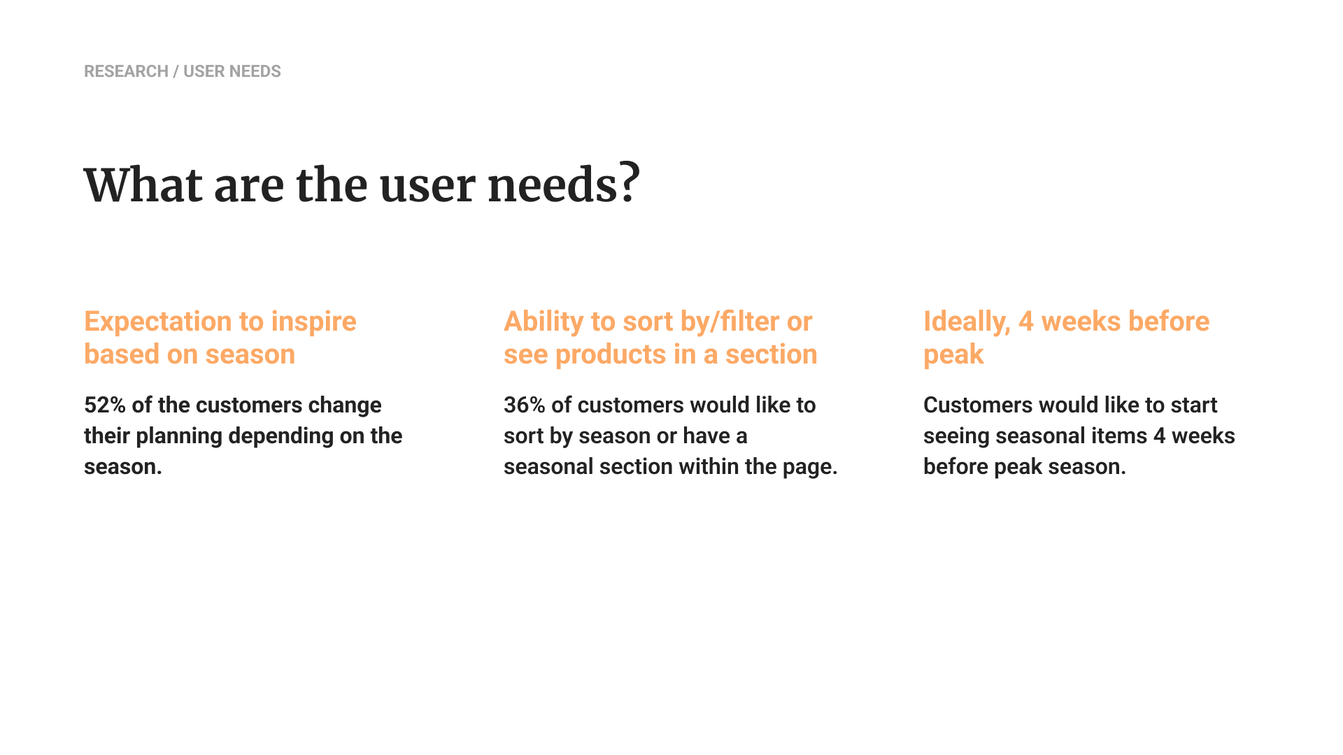
By combining these insights with broader user needs, such as planning inspiration, the desire to sort or view seasonal sections, and wanting to see items about four weeks before peak, I shaped the opportunity areas that guided ideation.

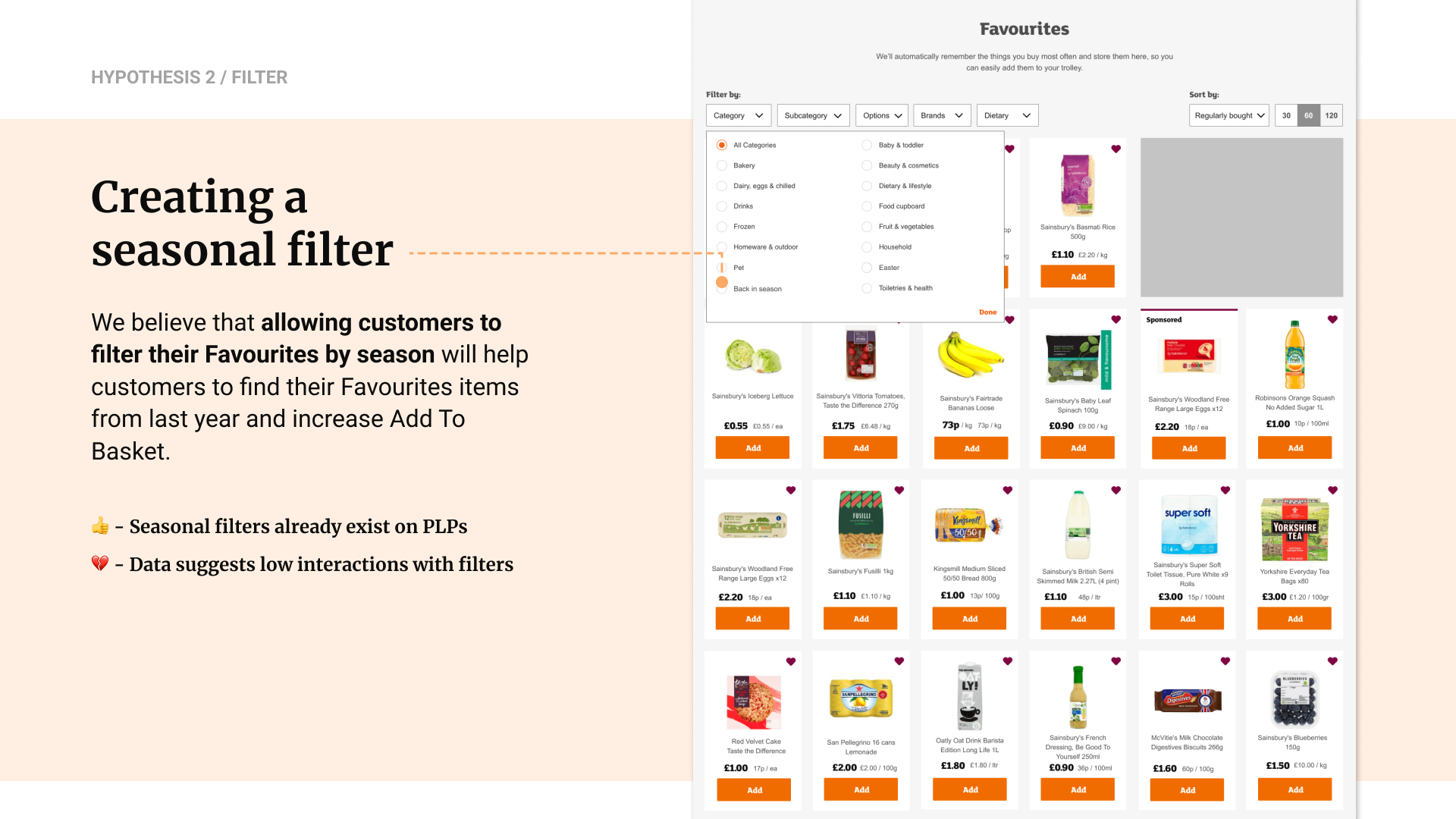
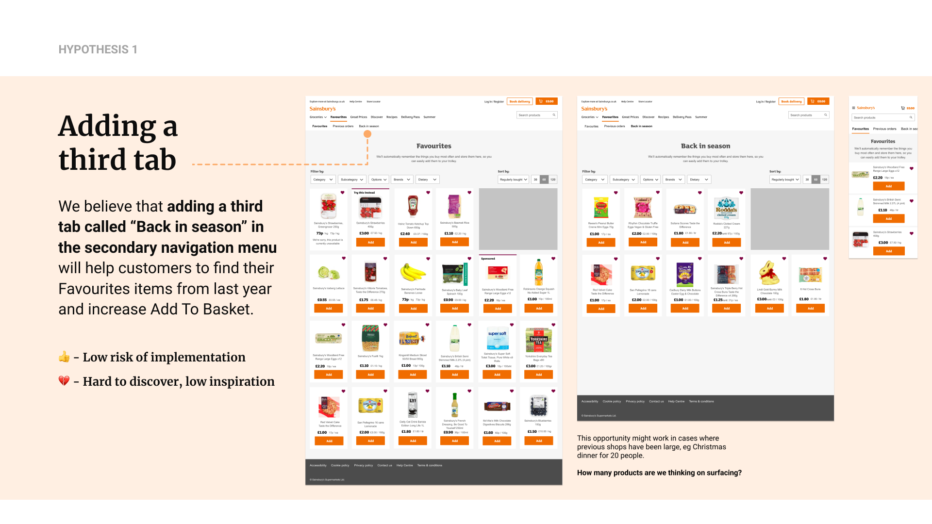
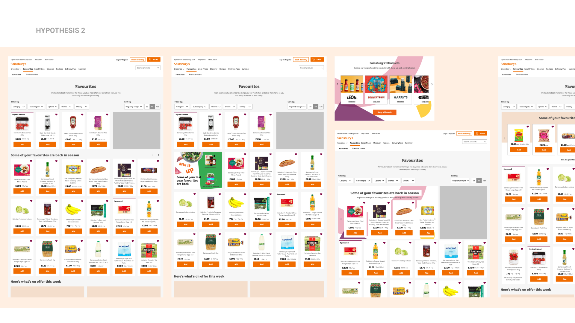
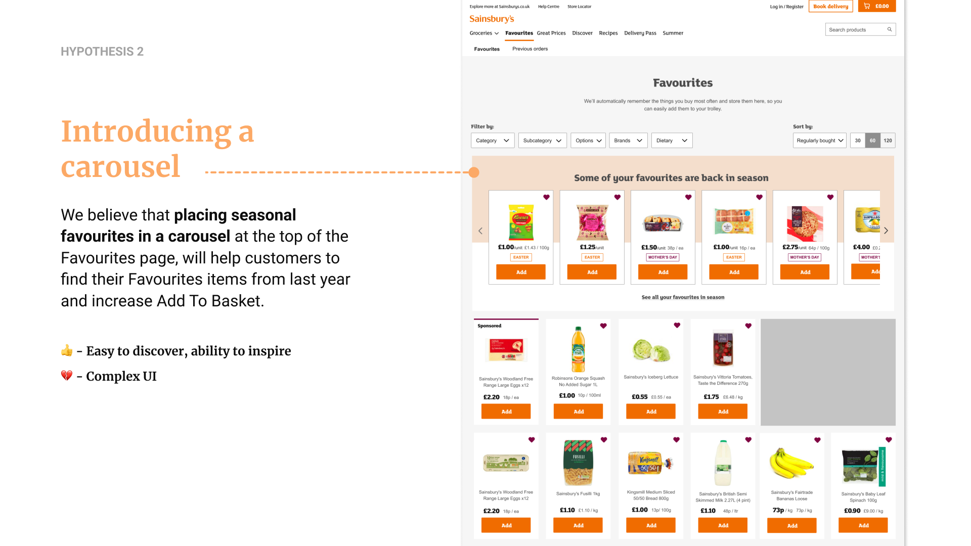
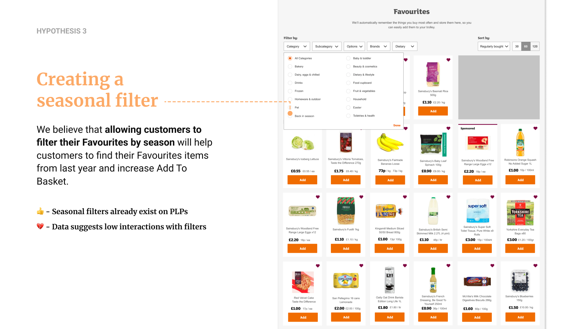
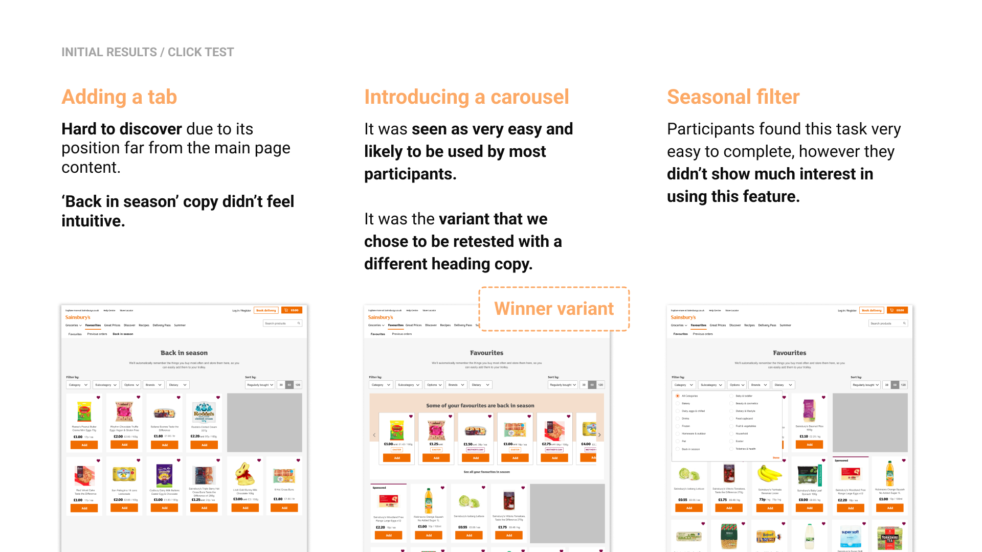
Building on the research insights, I explored multiple design hypotheses to help customers rediscover last year’s seasonal favourites. I tested three directions: adding a dedicated “Back in season” tab, introducing a seasonal filter, and placing a seasonal carousel at the top of the page. Each concept balanced different strengths and risks, from low effort implementations that were harder to discover, to more visible, inspirational solutions that added UI complexity.
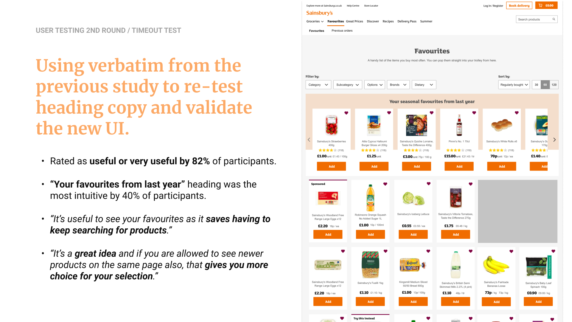
I tested all three prototypes to understand which solution was most discoverable, intuitive, and satisfying for customers, measuring task completion, time on task, and a simplified SUS. The results showed that while the new tab and seasonal filter were easy to use, they weren’t inspiring or intuitive enough. The carousel clearly emerged as the strongest concept, with participants finding it the easiest to notice and most likely to be used. After iterating on the heading copy using verbatim from the first round, the second test validated the direction: 82% rated it useful, and “Your favourites from last year” was the most intuitive label.
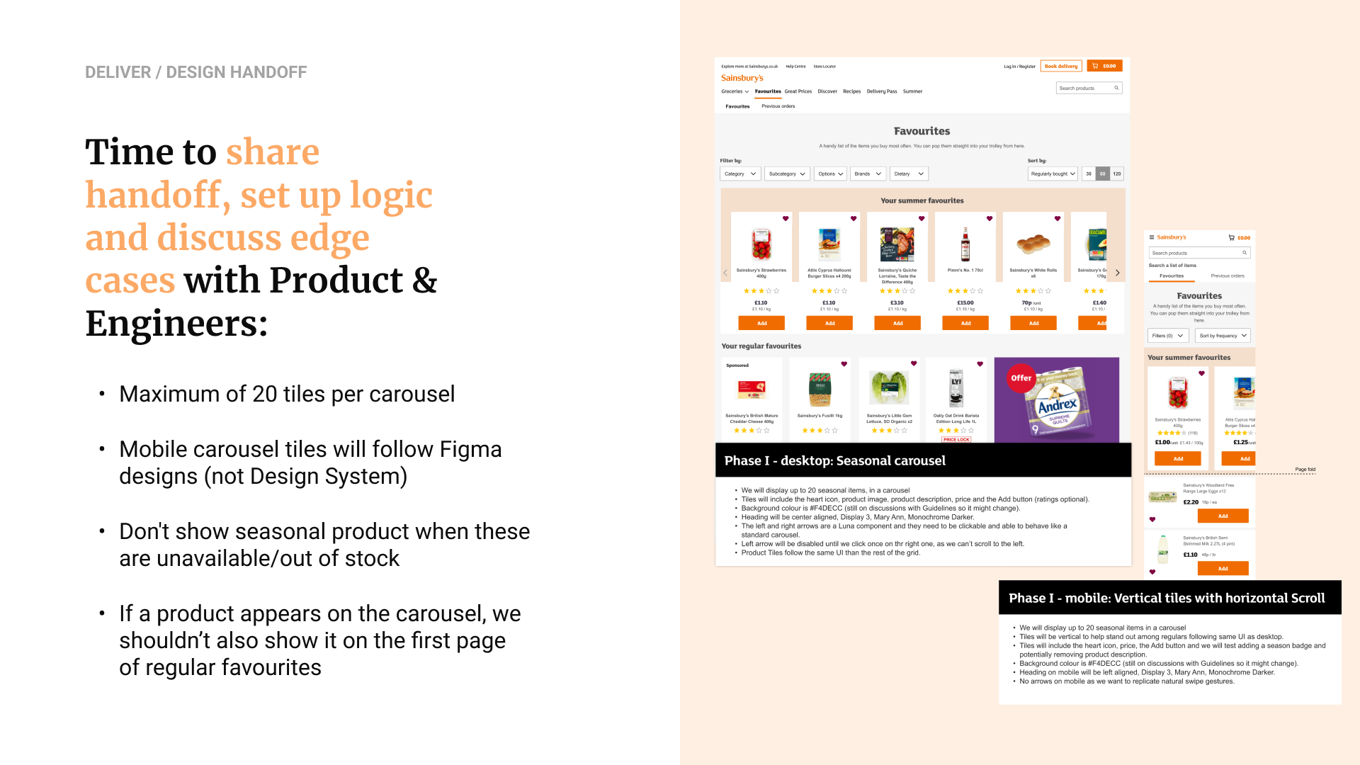
Moving into mobile, the carousel didn’t translate well within the constraints of the Luna Design System, so I partnered with an app designer to ideate a vertical layout that aligned with existing app patterns. Before finalising the component, I ran it through extensive cross-team reviews with guidelines, digital design, branding, accessibility teams.


During delivery, I worked closely with product and engineering to define the logic, edge cases, and implementation details for both desktop and mobile carousels. Aligning on product tile limits, stock rules, and how the mobile pattern would intentionally diverge from the Luna Design System. Together, we ensured the component worked smoothly across breakpoints while preserving clarity and performance.
The final designs launched successfully, and the impact was immediate: 35% of all Favourites sessions included adding at least one Seasonal Favourite to basket, with an average of two items added per session. The success of this component extended beyond the project—it became a foundational pattern for the wider groceries migration workstream, used in pages like Offers, Checkout, and the future Homepage, and ultimately contributing a scalable, reusable carousel to the design system.

let's connect.